
Sensing complex adaptive systems such as Value Streams can be tricky. There is an endless number of metrics you could use to get a sense of how a Value Stream is operating. Using too many metrics creates noise, which distracts you. Using too little, you might miss critical health indicators. Below are the customer-centric and flow-based metrics we believe to be useful at a higher level of analysis.
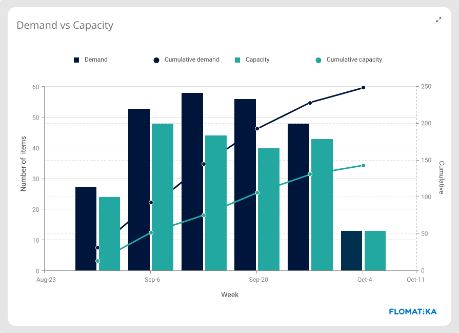
Capacity vs Demand
When measuring your Value Stream, the outermost information you want to know is how many requests are coming in and how many are going out. Your goal is to keep demand and capacity in balance.
Usually, across industries, if you have more demand than you have the capacity to supply, you’re either overwhelming your system, leaving money on the table, or both. In enterprise Digital Value Streams, it’s no different, with opportunity cost usually measured by the cost of delay.
When demand continuously exceeds capacity, Value Streams start seeing inventory accumulate. That isn’t a good thing, not in digital, not in any other industry.
Demand is usually measured in terms of new items added to the inventory (or backlog). Capacity is measured in terms of requests completed, both over a certain period.
Commitment rate and Time to commit
Being able to visualise and communicate these metrics to customers and stakeholders is a powerful tool to help set expectations and create alignment.
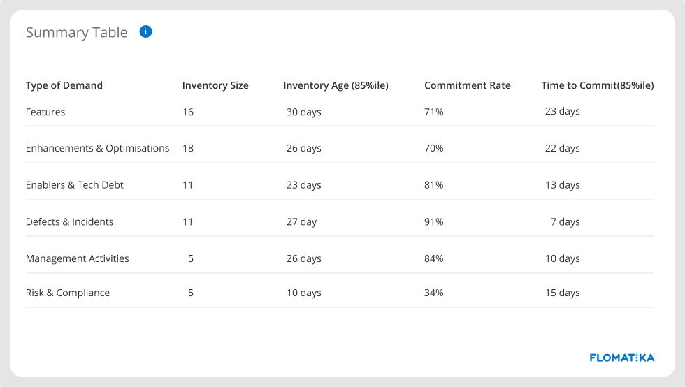
In the example above, defects and incidents have the highest commitment rate. Nine out of ten problems reported are worked upon, and it can take up to seven days for teams to start working on them. In contrast, risk and compliance demands have the lowest commitment rate.
Modern VSM platforms will provide you with this information regardless of the tools you use and the internal processes used by the different teams within your organisation.
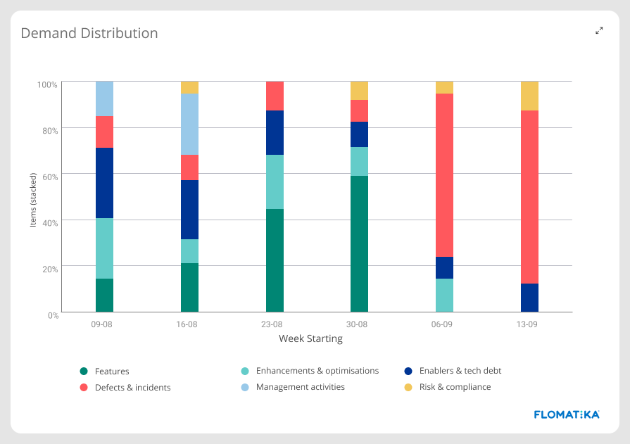
Demand distribution
Suppose you’re working on a digital Value Stream. It is almost certain that your demand far exceeds your capacity to supply. In that case, how do you prioritise your scarce capacity among:
- critical bugs,
- vital infrastructure improvements,
- the most anticipated product features,
- risk and compliance needs,
- essential enhancements to improve customer experience?
When that happens, Value Streams usually introduce demand shaping strategies through capacity allocation to ensure that equally important demands are receiving some capacity.
Having a real-time view of the distribution of the demand types your Value Stream is processing will give you invaluable governance insights whether you are over-focusing on specific types of demand and neglecting others, and will provide you with a governance framework for capacity allocation.
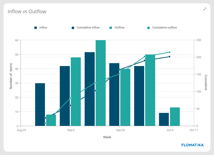
Inflow vs Outflow
The rate at which work arrives and departs your delivery system. When Inflow continuously exceeds outflow, Value Streams start accumulating work-in-process (WIP), which leads to a degradation of quality and delayed work, leading to the increase of failure demands, bringing pressure from stakeholders. Out-of-control WIP is a serious problem and a common origin for a classic ‘negative feedback loop’ cycle that affects trust and creates abusive work environments.
Inflow is measured by the number of work crossing the commitment point of the workflow, whereas Outflow is measured by the number of work crossing the departure point of the workflow.
Class of Service
Imagine class of service as the priority at which the work enters your delivery system. Units of work with a higher class of service (expedite) will receive more overall capacity from the system than work with a standard class of service.
Ideally, Value Streams would get most of the work to follow a defined process with a few of them having to meet specific delivery dates (fixed date).
Visualising and communicating the class of service distribution can provide you with insights into how the overall delivery ecosystem is operating. For example, when you see a large portion of the work being expedited, that’s usually a sign of an overwhelmed system operating under a state of urgency.
When that’s the case, an essential first step is to visualise and acknowledge it. Then take strict measures to control WIP and bring the system back to a stable state.
Lead time, SLE Target Met, and Predictably
Lead time is the time your delivery ecosystem takes to satisfy a customer request. It is represented here by the elapsed time between customer order being accepted (commitment point) and being delivered (departure point).
Knowing your time to market and how it matches customer SLE is a core fitness evaluation capability for any Value Stream.
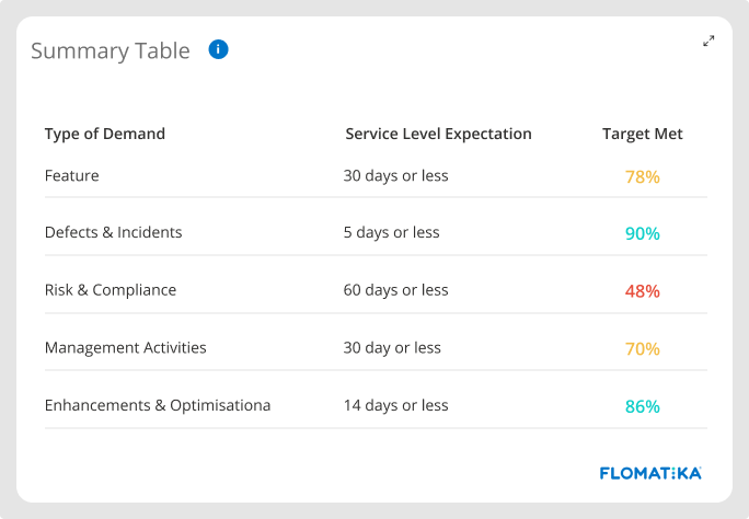
Another important signal is the level of confidence (predictability) that a new committed demand will be completed within the expected SLE. That is measured per demand + class of service. For example:
- New feature request operating under a standard class of service
- New feature request operating under an expedited class of service
- New bug request operating under a standard class of service
- New bug request operating under an expedited class of service
When it comes to measuring lead time, there are many levels of sophistication that can be used to identify the shape of the lead time distribution and its risk profile. However, as a rule of thumb, the important thing to know is if your lead time distribution has either a short or a long tail.
Lead time distributions with long-tails are more susceptible to high-impact caused by long, painful delays, directly affecting customer satisfaction and potentially damaging customer trust.
For example, when a customer asks when will their request be ready and we tell them that our Value Stream usually processes that type of demand in 12 to 20 days and it ends up taking 133 days (or about ten times longer than what we told them to expect), they will certainly be disappointed by this one negative experience and no longer trust the service delivery. Consequently, every future request they make will have a deadline attached and penalties for failing to deliver. Check out more about lead time distribution here.
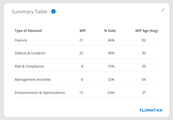
WIP Age & Stale Work
Lead time is a vital indicator, but it is also a lagging indicator. To anticipate problems, you should also look at the age of your work-in-process (WIP).
Having a clear view of how the work is ageing within your delivery ecosystem is critical for managing your Value Stream. Older work tends to get stale and end up abandoned. If that happens often, you might be operating at a batch size that is not optimal for the level of variability currently in your system. Other common reasons causing stale work include uncontrolled WIP levels and premature commitment.
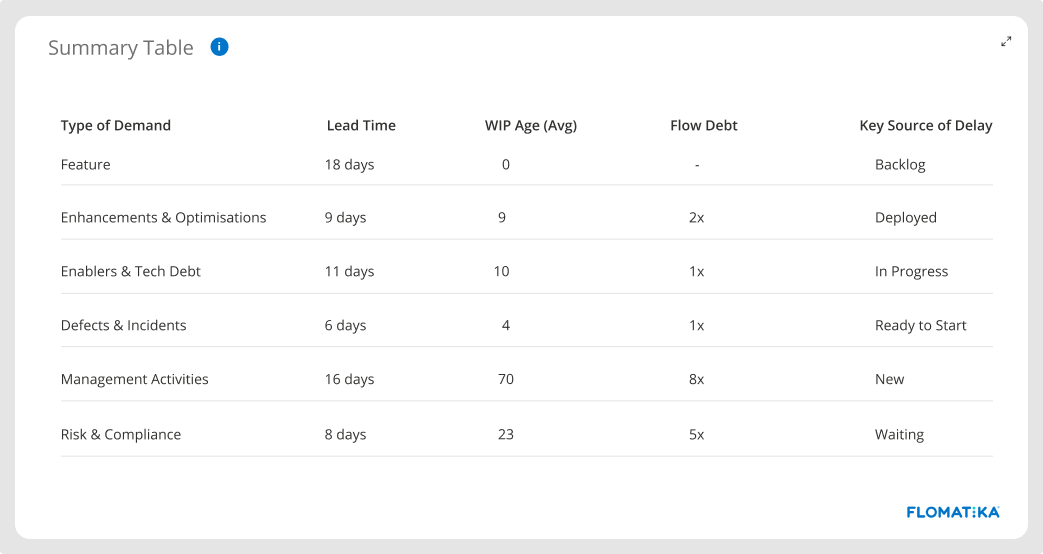
Flow Debt
You can find whether your delivery system is accumulating flow debt by comparing the lead time distribution with the WIP Age distribution.
If, for instance, 85% of your work was completed in 20 days or less, and now 85% of the work has been in process for up to 60 days, it means that, at that point of the distribution (85 percentile), your system is currently operating at a degraded state than it has previously operated. In that case, the system has degraded by a factor of 3. So that’s your flow debt: 3X.
Flow debt is a leading indicator. We should monitor it because it may give an early warning of problems that will eventually manifest in failure to be fit-for-purpose.
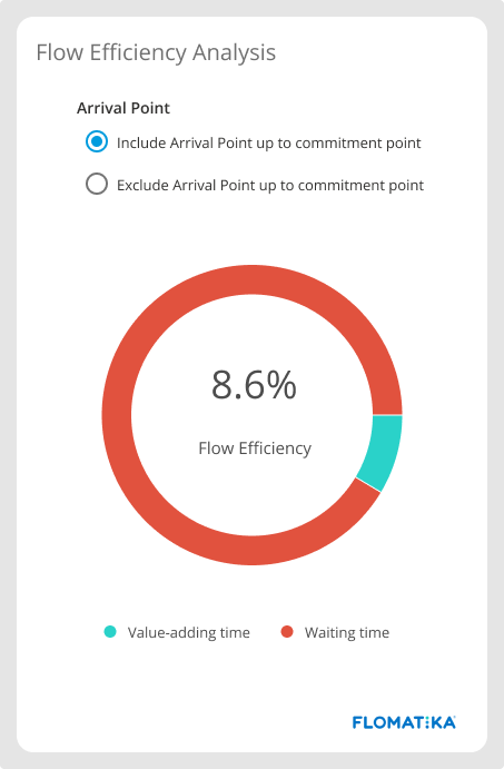
Flow Efficiency
Say a unit of work took 25 days to complete. From those, the work spent five days on active states of the workflow, where individual contributors were actively working on it, transforming it from customer request to value. From those 25 days, the work spent 20 days on several queues within the system, including queues before and after the commitment point.
The value-adding time ended up being just five days, which represents 20% of the total time. We indicate that as Flow Efficiency - the amount of active (value-adding) time in relation to total (elapsed) time. That’s for one item.
Now let’s say in the last period (30 days, for instance), a Value Stream has completed 51 items. When we sum the days each unit of work spent in active steps, we found 37 days. When we did the same with the number of days the work spent in queues throughout the process, we found 93 days. That means that for the batch of work completed over the last 30 days, the flow efficiency was 28.5% (37 out of 130 days), indicating that 71.5% of the lead time was made out of waiting time or delays. That’s a common characteristic of knowledge work Value Streams. There are many delays built into it—most of them by design.
The top 10 sources of delay and waste in Value Streams are:
- Value Streams designed to operate with several handovers
- Unmanaged dependencies between teams and specialists
- Uncontrolled volume of work-in-process (WIP)
- Team liquidity (ability to match work to available skills)
- High-volume of manual and repetitive work
- Premature commitment
- Blockers
- Excessive interruptions caused by weak pull-policies
- Work unappropriated sliced in big batches
- Too many Expedite due to high volume of failure demand
Our empirical observation over the years shows the following brackets for Flow Efficiency:
0% - 15% range
Unfortunately, that’s the most common bracket encountered in Digital Value Streams. That usually happens when teams have no flow awareness whatsoever. Although queues exist throughout the workflow, their meaning is not explicit. Teams see no harm in leaving work idling in queues. This cause-and-effect relation does not exist explicitly in their mental models.
Flow Efficiency will show you how many delays there are in your Value Stream. Systems operating at this level will probably exhibit all sorts of problems and dysfunctions traditionally known in the software industry.
16% - 40% range
Teams operating in this bracket are usually flow aware. They understand the concept of queues and the damage they can cause to the overall system performance. They are actively executing continuous improvement activities and are already seizing some benefits.
41% - 60% range
At this level, Value Streams are ultra-aware of flow and actively engaged in reducing lead time and increasing predictability levels. They are operating with strict and explicit pull-transaction policies throughout and are actively controlling WIP. At this stage, Inventory also starts to receive explicit policies.
61% - 80% range
We rarely observe Flow Efficiency at this level at full customer-facing end-to-end Value Streams.
For that to happen, teams must:
- Be fully independent (mission teams)
- Be cross-functional
- Have a high liquidity
- Always working with optimal batch size
- Always postponing commitments to the last responsible moment
- Actively controlling WIP
- Working under strict and explicit pull-transaction policies throughout
- Have strict control of the types and sources of demand coming through
81% - 100% range
Not commonly attainable for knowledge-work. Usually, when we see Flow Efficiency at this level, it means the queues of the system are mostly hidden, and the workflow stages are mainly represented by active steps. Here, they also have no flow awareness and are less mature than the first group (0% - 15%) because queues here are mostly invisible.
A higher Flow Efficiency allows Value Streams to learn more and faster as they can execute build-measure-learn cycles more often and therefore have their effectiveness increased as they are closely aligned with customers and stakeholders.
It allows for greater responsiveness as well as usually batch size is small, allowing faster pivots. Throughput of value-demand is much higher as teams don’t spend much capacity with failure demands. Predictability is high, as is the stability of the overall system. There’s much professional pride going on and frequent kicks of dopamine as teams are frequently achieving and receiving feedback.
As you’d expect, a Value Stream operating with low Flow Efficiency has many challenges. Their maintenance cost is usually high with lots of rework. They typically operate in a low trust environment and are frequently fire fighting. When things go wrong, the time to recover is usually higher than desired. Lead time is extended, with part of the work being completed within an acceptable time frame, but some taking months to complete. Not surprisingly, they have a high burnout rate, which leads to a high turnover rate, which just makes everything else worse. Does that sound familiar?
Start Measuring Top- Level Metrics effectively using Flomatika and transform your delivery ecosystem.
Schedule A Demo Today


%20(1).jpg)
.jpg)
